
RAUVISIO house lines
Once all the products had gone through brand elevation it was time to get to work on the entire line as a group. The RAUVISIO “house lines” were born. The RAUVISIO house was then identified as a collective and I provided definition as a thought leader in the design, craftsman and woodworker space.
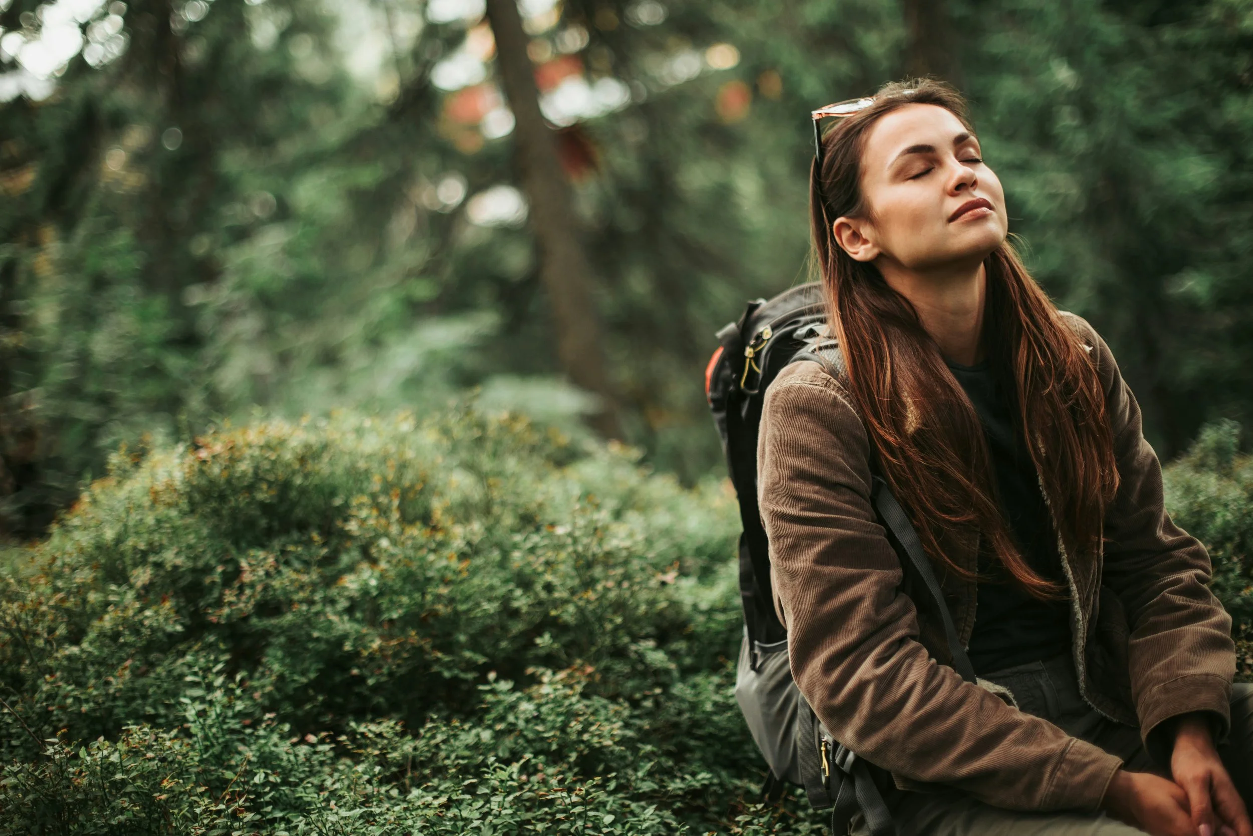
RAUVISIO terra
This soft textured HPL surface needed was missing a compelling story. The creative storytelling approached used was the time of day in the forest. The collections and their surface ensembles create provocative pieces of story needed to transport you to that magical place during your hike in the forrest.
RAUVISIO ferro
RAUVISIO ferro metallic PET surface was reintroduced with the goal of creating a powerful narrative. By linking metallic finishes to various historic innovations from antiquity to modernity, I crafted a compelling story of metals that seamlessly integrated into the client's four new color lines.

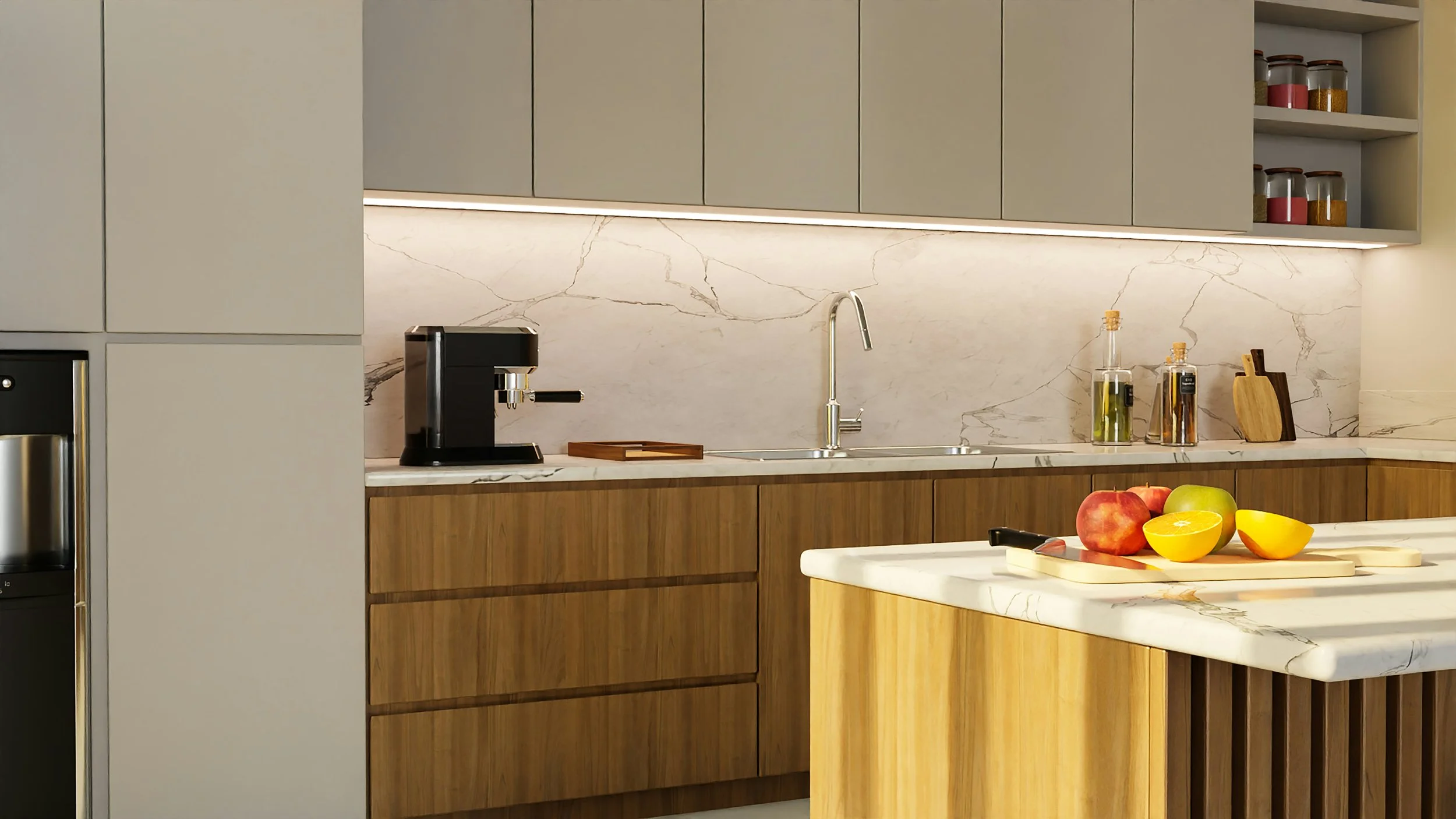
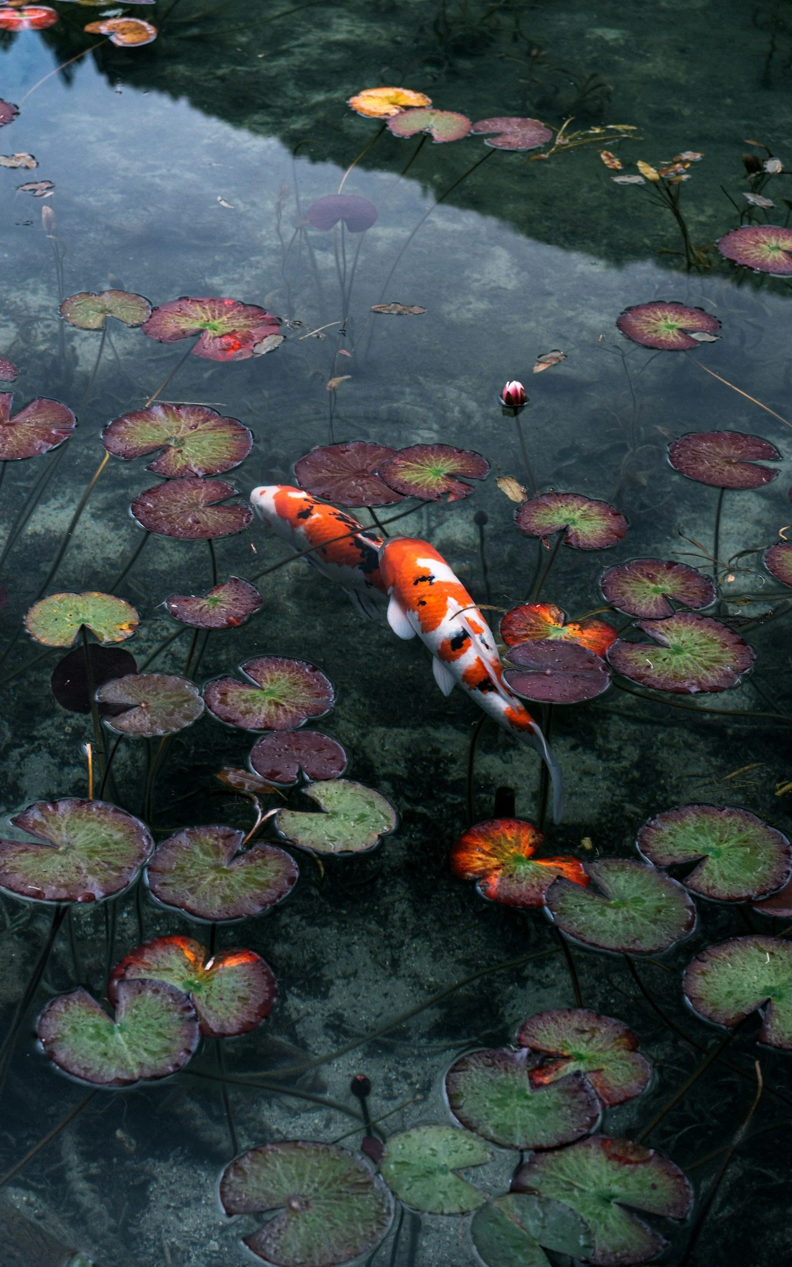
RAUVISIO crystal
The goal for RAUVISIO crystal, a reflective acrylic furniture surface, was to craft a memorable story centered around the natural beauty of crystals and geology. Inspired by the dazzling natural and polished textures, the brand was relaunched with new branding designed to captivate and reenergize its audience.
RAUVISIO ingrain
Introduced in 2022, RAUVISIO ingrain wood fiber laminate surface was the first of its kind to incorporate wood fiber into its construction. With its exceptionally soft, textured surface and innovative edge banding, it became the perfect candidate for a narrative centered around the power of synchronized patterns in nature, highlighting their calming and astonishing effects.

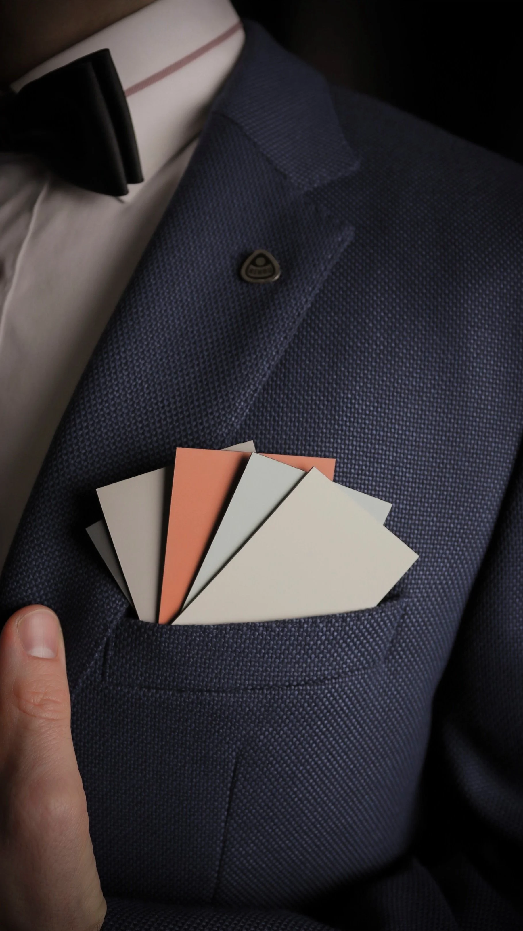
RAUVISIO brilliant
The rebranding of RAUVISIO brilliant high-gloss acrylic surface achieved sheer perfection. Its deeply reflective, high-gloss finish evoked a sense of water, inspiring a connection to natural beauty. The profound color and lustrous finish created elegant visual stories, transporting you from desert to glacier. The brand elevation emphasized travel and the nostalgic memories of vacations by lakes, rivers, and seas, immersing these experiences in the designer audience's imagination.
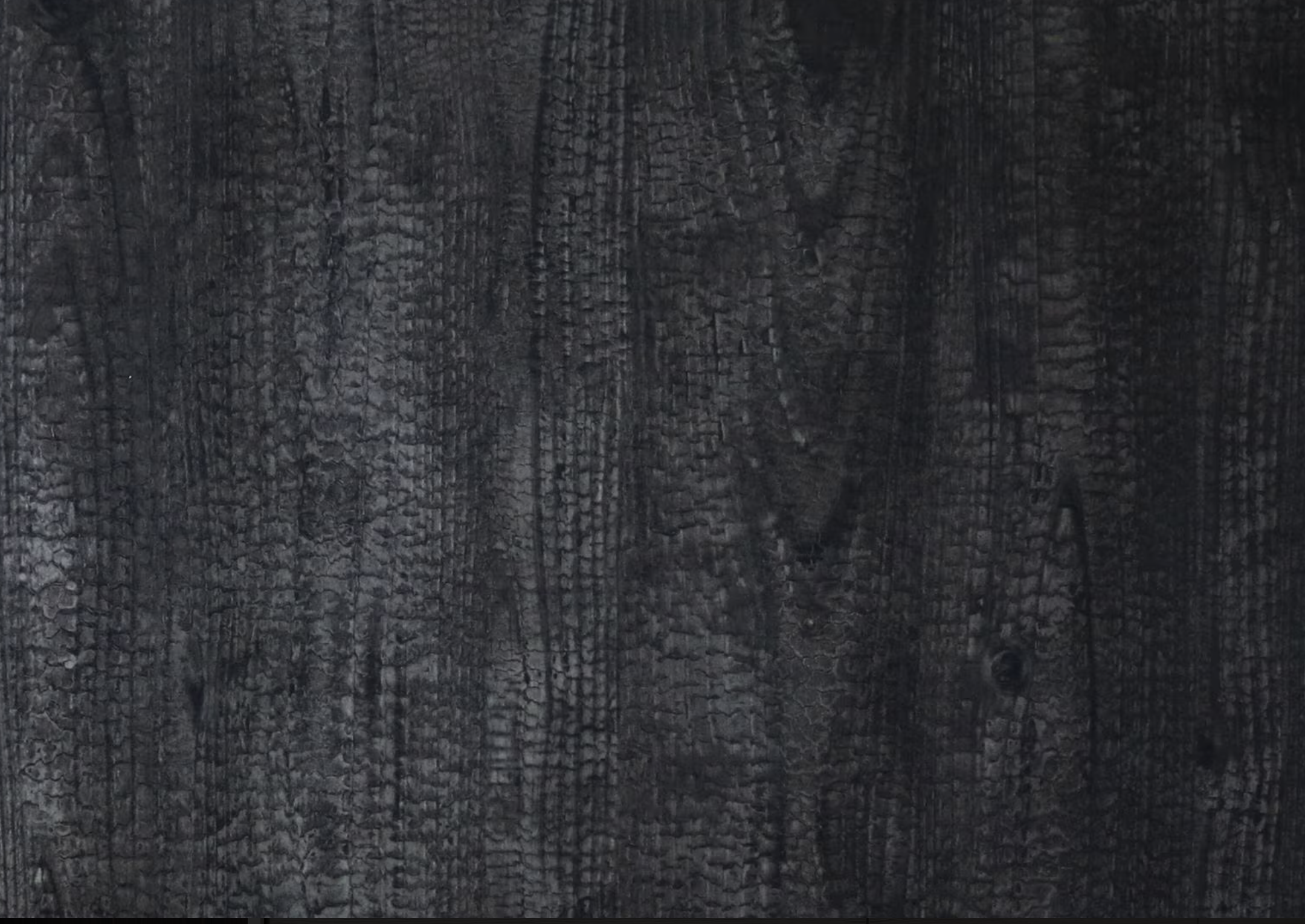
RAUVISIO noir
The monotonic matte surface was the first to undergo brand elevation. Introduced in 2020, Noir embodies the elegance and resilience of matte, with self-healing, fingerprint-resistant, and scratch-proof properties. These qualities made it a perfect fit for the film genre noir, representing the ultimate foundational surface. Initially launched in classic black and white, Noir expanded two years later with a new color line. I focused on naming the colors, developing branding, crafting color stories, and producing videos. I was responsible for creative copy and story development, selecting images, curating collection swatches, and preparing introductory materials. I personally photographed elements to create the initial look and styling of the brochures. It was an exciting project that lead to the brand elevation for all the lines that would follow.
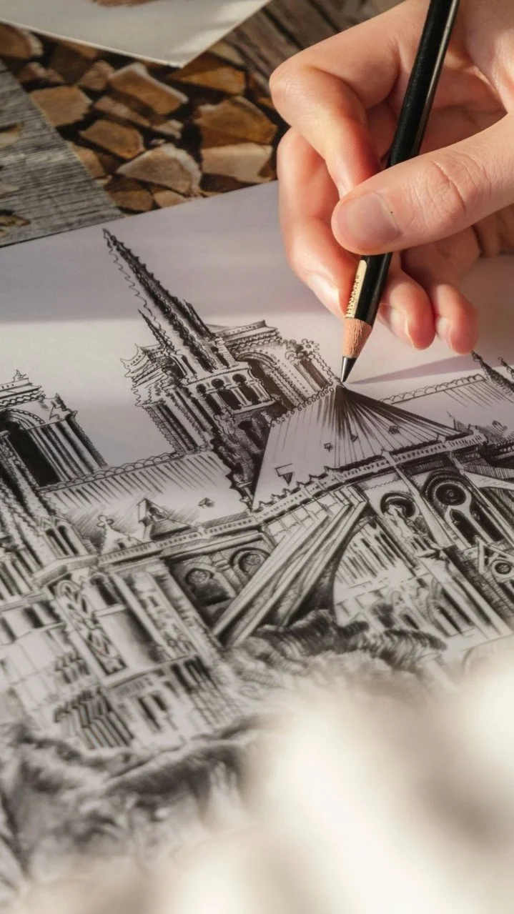

RAUVISIO shade
From cave drawings to the Sistine Chapel, the hand-drawn line has always expressed our human experience. This super-matte PET surface, with its chalky texture available in grey, white, and black, was designed to complement the RAUVISIO noir collection, catering to large-scale commercial use in offices, hospitality venues, and storefront displays. This project was particularly rewarding for me as it required reinventing the client's perception of matte and highlighting its robust properties.